Streamlit Data Visualization
A guide to creating a web application showing the visualization of a dataset using Streamlit.


Goals
- Create a web application displaying Steph Curry's statistics from 2009 to 2021.
- Installing Streamlit
- Set up a Streamlit web application
- Working with data using Pandas
Introduction
Streamlit is an open-source Python framework used for building interactive web applications. It simplifies the process of creating and deploying data science and machine learning models by providing a user-friendly interface. With Streamlit, Python scripts can be converted into web applications without the need for extensive web development knowledge. It allows a coder to create interactive and responsive UI components, such as sliders, buttons, dropdown menus, and data visualizations, with just a few lines of code. Coding with Streamlit is similar to coding with Graphic User Interface modules like tkinter, where the coder can add widgets and interactive functions to the application. This creates a “junior version” of a project where the coder does not have to worry about Webserver developing with POST and GET methods, but focus more on front-end developing like sorting through data with Pandas module, and back-end GUI development. Hence, this tackles the Play the whole game principle of Perkins’ Making Learning Whole paradigm.
# pip install streamlit
After installing Streamlit, create a blank Python file. For example: curry.py. Then a blank server can be displayed using the following command in cmd terminal:
# streamlit run curry.py
# streamlit run (Python file name)
While not necessary, it is convenient to enable Rerun on save. This allows the web application to be updated everytime the Python file is changed and saved. It is done by clicking on the three horizontal bars on the upper right corner. Then click on Settings and check the Run on save box.
Adding Web Application Titles and Introduction
In the Python file curry.py, import the module streamlit. Then, the title and subheading of the web application can be displayed using the Streamlit API text widgets st.markdown. This shows lines of markdown text that can be modified. As an example, the color of the title will be changed to the Warriors yellow using hex-code color through markdown format. In addition, it is important to use the argument unsafe_allow_html=True as it allows color markdown format to show in the web application. Please refer to Streamlit API Documentation for more details regarding different types of Streamlit widgets.
import streamlit as st

st.markdown('# <font color="#ffc72c">Stephen Curry NBA Statistics</font>', unsafe_allow_html=True)
st.markdown('*Gia Khang Ngo*')
st.markdown('## <font color="#006BB6">Introduction</font>', unsafe_allow_html=True)
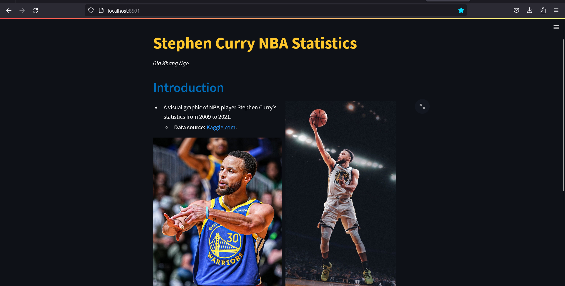
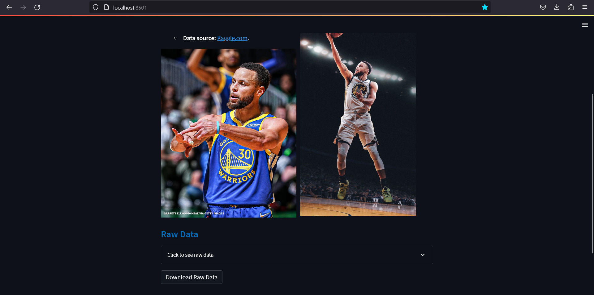
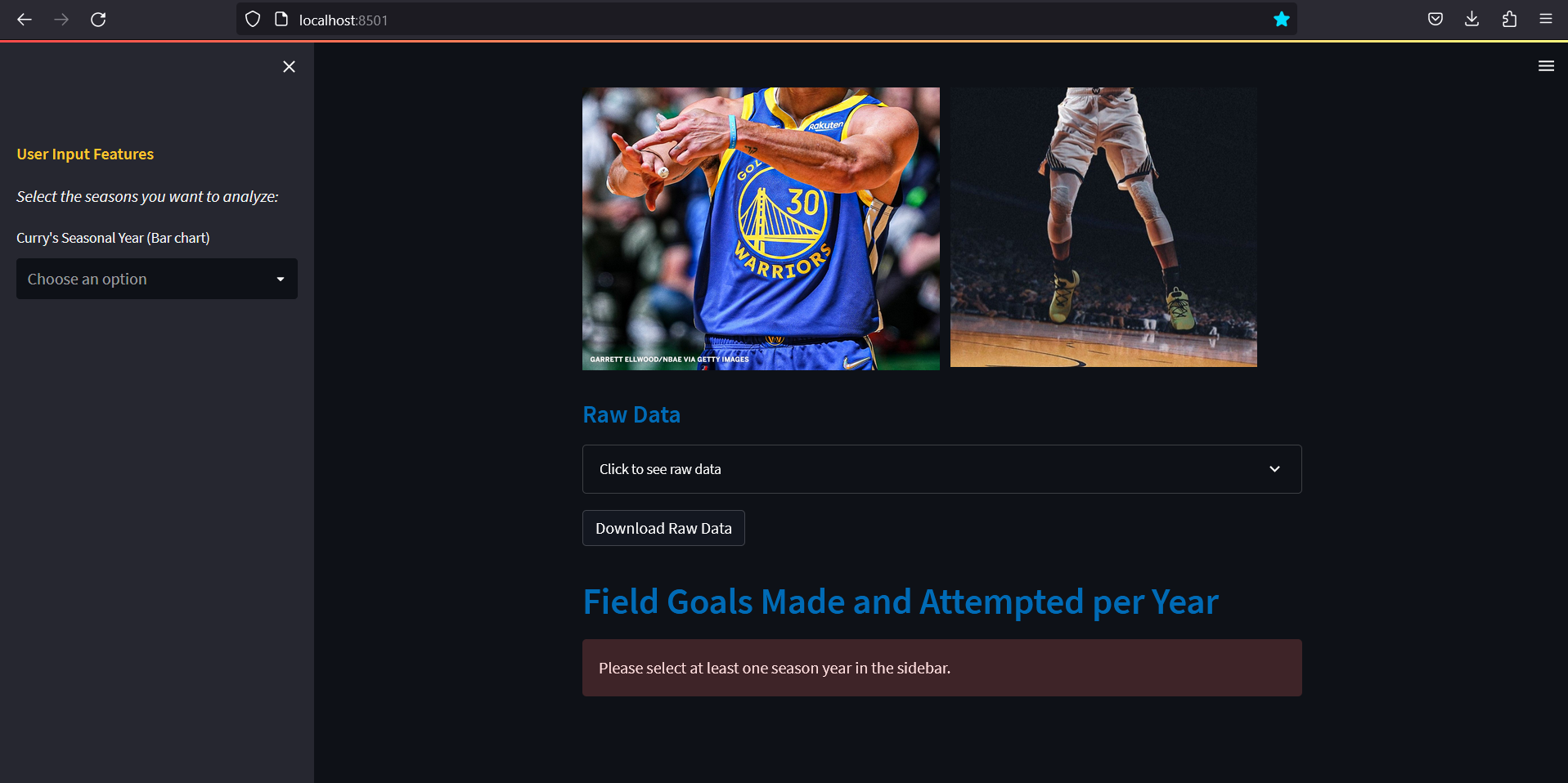
With the Introduction, if it is preffered to display two images or two blocks of texts side-by-side, st.columns is used to insert containers laid out as side-by-side columns. This is similar to GUI development with tkinter grid with rows and columns. Two column containers are created. Then in each columns, an image is inserted using st.image, where a link to the image is posted and the argument width is used to set the image size. Moreover, with st.markdown, a brief introduction is provided with the link to the original data source.
col1,col2, =st.columns(2)
with col2:
    st.image('https://i.pinimg.com/originals/82/9a/82/829a82bd6f39f7456c6f4cc2dacc27f6.jpg', width= 300)

with col1:
    st.markdown('''* A visual graphic of NBA player Stephen Curry's statistics from 2009 to 2021.
    * **Data source:** [Kaggle.com](https://www.kaggle.com/datasets/mujinjo/stephen-curry-stats-20092021-in-nba).''')

    st.image('https://pbs.twimg.com/media/FVbqDw1WQAM6BmI?format=jpg&name=large', width= 350)
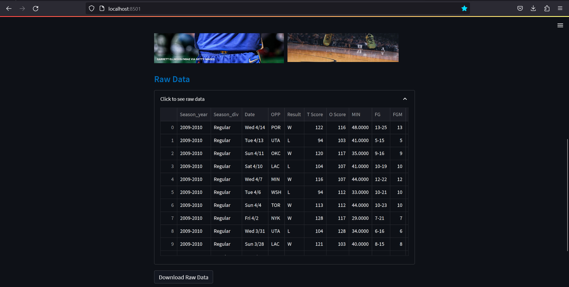
Import and Display Raw Data
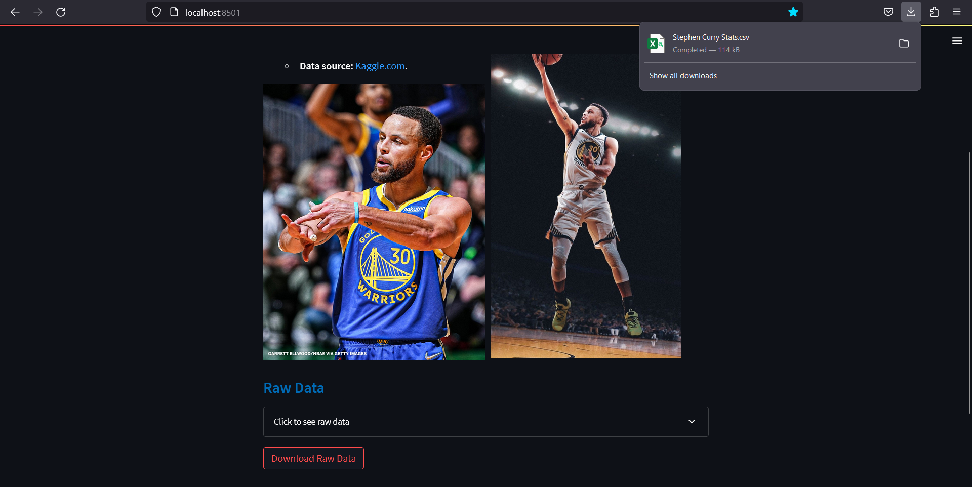
The csv file containing Stephen Curry data is imported using Pandas module through pd.read_csv. Then st.expander is used to create a container that can be expanded or collapsed. This container holds the data table, to make the layout less clustered. With st.dataframe, the Pandas dataframe is displayed in a table in Streamlit. Furthermore, a download button can be created using st.download_button to allow the user to download the utf-8 encoded csv file of the database. The argument mime is used to set the MIME type of the data, which is csv.
import pandas as pd

curry_data = pd.read_csv('./streamlit-supp/Stephen-Curry-Stats.csv')
st.markdown('#### <font color = "#006BB6">Raw Data', unsafe_allow_html=True)
check_data = st.expander('Click to see raw data')
with check_data:
    st.dataframe(curry_data)

# Download Data Button
st.download_button(label= 'Download Raw Data', data=curry_data.to_csv().encode('utf-8'), file_name='Stephen Curry Stats.csv', mime='text/csv')
Collapsed Raw data:
Expanded Raw data:
Using Download button:
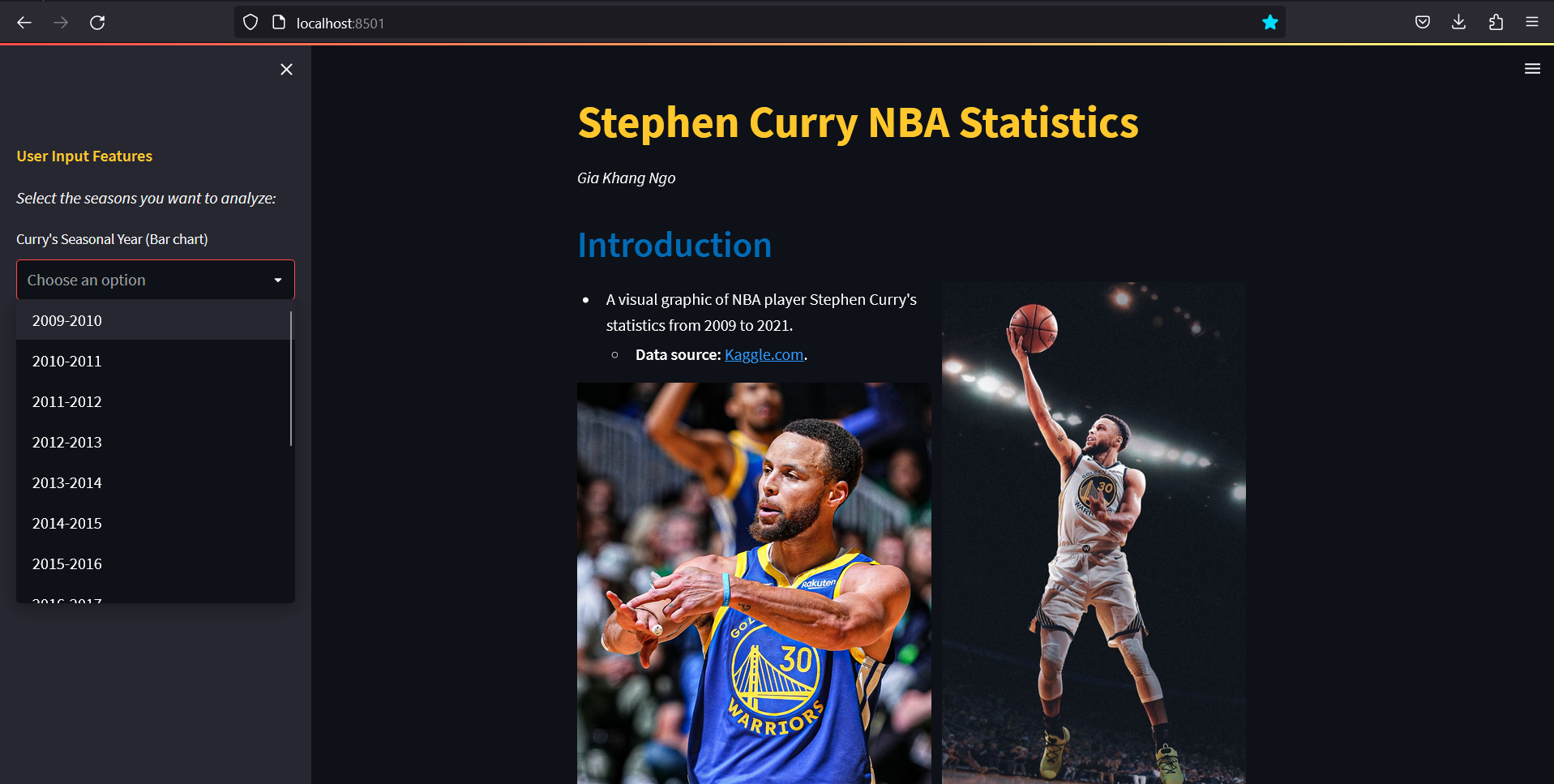
Sidebar for User Inputs
In order to add more features and allow user inputs, st.sidebar is used to create a sidebar of the web application. In order to access and implement widgets in the sidebar, access it using st.sidebar.(widget). For example with st.sidebar.markdown, a markdown text is displayed in the sidebar, with functions similar to st.markdown for the main page. Moreover, st.sidebar.multiselect adds a dropdown menu, where the user can input which season years they would like to display the data for. The user input is assigned to a python variable for further data sorting with Pandas.
st.sidebar.markdown('**<font color="#ffc72c">User Input Features</font>**', unsafe_allow_html=True)
st.sidebar.markdown("*Select the seasons you want to analyze:*")
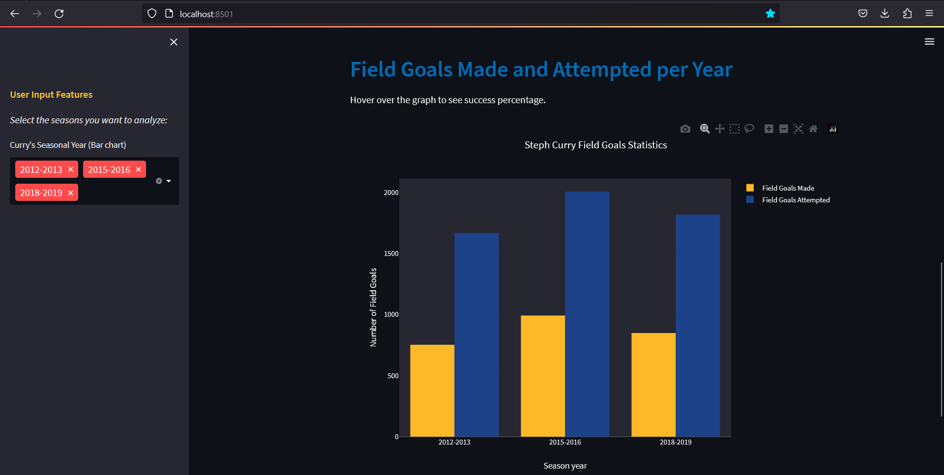
season_year = st.sidebar.multiselect('Curry\'s Seasonal Year (Bar chart)', curry_data['Season_year'].unique())
Bar Chart Plotting for Field Goals
Before plotting, it is necessary to take into account what will happen when the user does not input any seasonal year. An if-else statement is used for said situation, where the else statement contains st.error, which shows an error asking the user to input at least one seasonal year if there are none inputted. Within the if statement, the Field goal data is sorted using Pandas slicing for the user-inputted seasonal years. Then the success rate is calculated using the Field Goals Made and Field Goals Attempted data. It is important to note that the Python method sorted is used to sort the user-inputted seasonal years. This means that no matter the order that the user selected the years, the seasonal years displayed on the bar chart is always from the earliest to the latest.
To plot the bar chart, the Python charting library plotly is used through st.plotly_chart, specifically plotly.graph_objects is imported to access the bar chart drawing functions. matplotlib.pyplot may also be used through st.pyplot. However, plotly is integrated better with Streamlit. Please refer to the Chart elements section of the API Documentation for more details about the available Streamlit plotting widgets.
Looking at the code section below, an instance go.Figure is created where the argument contains the method go.Bar to plot the bar graphs of the Field Goals Made (FGM) and Field Goals Attempted (FGA) of the user-inputted seasonal years. Within it, the hovertext argument in plotly allows the user to hover over the bar chart to see the percentage success, calculated using the FGM and FGA. Finally, the graph title and axis labels are edited using update_layout method. Then, the Figure instance is inputted to st.plotly_chart to display the graph on the web appplication.
import plotly.graph_objects as go

st.markdown('## <font color = "#006BB6">Field Goals Made and Attempted per Year', unsafe_allow_html=True)

if season_year:
    st.write('Hover over the graph to see success percentage.')
    list_year = []
    list_FGA = []
    list_FGM = []
    list_percent = []

    # Create lists of seasonal years, field goals attempts, field goals mades.
    for i_year in sorted(season_year):
        yA = curry_data[curry_data['Season_year'] == i_year]['FGA'].sum()   # The sum of field goals attempted for the user-inputted season years
        yM = curry_data[curry_data['Season_year'] == i_year]['FGM'].sum()   # The sum of field goals made for the user-inputted season years
        list_year.append(i_year)
        list_FGA.append(yA)
        list_FGM.append(yM)
        list_percent.append(f'Success rate: {yM/yA*100:.1f}%')              # Success rate list by dividing field goals made by field goals attempted

    # Plot bar chart
    fig1 = go.Figure(data=[
        go.Bar(x=list_year, y=list_FGM, name='Field Goals Made',
        hovertext=list_percent, marker_color='rgb(253, 185, 39)'),
        go.Bar(x=list_year, y=list_FGA, name='Field Goals Attempted',
        hovertext=list_percent, marker_color='rgb(29, 66, 138)')
    ])

    fig1 = fig1.update_layout(
        title='Steph Curry Field Goals Statistics',
        xaxis_title='Season year',
        yaxis_title='Number of Field Goals',
        width=800,
        height=600
    )
    st.plotly_chart(fig1)

# Display error when no season year is inputed
else:
    st.error("Please select at least one season year in the sidebar.")
Error when no user inputs:
Bar chart:
Supplementerary exercise 1
In order to drill in all the information, it is a good idea to do a few exercises. The first exercise is to extend on all the given codes given on this blog, based on the Stephen Curry statistics csv file.
First, please copy and paste all the codes from the beginning of the blog to a new python file. Or, simply download curry.py from the following GitHub link under the Code folder. Then, write a code block to display a heat map showing Stephen Curry's assists made vs minutes played. The code must contains:
- A subheading with similar color font.
- Data slicing with Pandas.
- A heat map displaying Stephen Curry's assists made for minutes played. Hint: look up
go.Figureandgo.Histogram2dfunctions fromplotly.graph_objects, which can be found in the API Documentation. - An error being displayed if there are no season year inputted.
- Some comments on what the data visualization shows about the data.
An example of what the heat map looks like on the web application:
Answer:
#Heat map for Curry's assists made for minutes played
st.markdown('## <font color = "#006BB6">Assists made for Minutes Played', unsafe_allow_html=True)
if season_year:
    #Create empty lists for assists and minutes to add to
    list_AST = []
    list_MIN = []

    #loops through and adds the assists and minutes from the csv file for the years the user chooses
    for i_year in season_year:
        yAST = curry_data[curry_data['Season_year'] == i_year]['AST'].to_list()
        yMIN = curry_data[curry_data['Season_year'] == i_year]['MIN'].to_list()
        list_AST.extend(yAST)
        list_MIN.extend(yMIN)

    #creates graph in the form of a 2d histogram (AKA a heatmap), and changes size if each square on heatmap
    fig3 = go.Figure(data=
        go.Histogram2d(x=list_MIN, y=list_AST,
        autobinx=False,
        xbins=dict(size=0.9),
        autobiny=False,
        ybins=dict(size=0.9)
        ))

    #adds title and axis names
    fig3 = fig3.update_layout(
        title='Steph Curry Assists per Minute Played',
        xaxis_title='Minutes',
        yaxis_title='Assists'
        )

    #plots graph
    st.plotly_chart(fig3)

    st.markdown('- The heatmap demonstates Steph Curry\'s average assists made for the amount of minutes played in a game.')
    st.markdown('- Stephen Curry normally averages 4-8 assists and 30-40 minutes played per game.')

# Display error when no season year is chosen
else:
    st.error("Please select at least one season year in the sidebar.")
Supplementary exercise 2
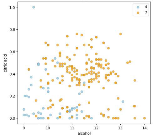
Finally, please design a web application with your own theme and layout, using the Red Wine Quality data, which can be downloaded from the UCI Repository. The data can be seen under the table below:
wine_data = pd.read_csv('streamlit-supp/winequality-red.csv', sep=';')
wine_data
The data visualization web application should contain:
- A title
- Subheadings
- Data table and download button
- Two user-inputted functions of choice to select different wine qualities. Suggestion:
st.selectboxfrom API Documentation - A scatter plot showing two attributes of your choice (for example: citric acid vs alcohol), of the two user-inputted wine qualities. Hint: Use plotly or pyplot, with
st.plotly_chartorst.pyplotrespectively
An example of a scatter plot displaying wine citric acid vs alcohol content when the user inputted wine quality 4 and 7:
Conclusion
Through Streamlit, one can easily create a web application displaying data visualization. Using the Field Goals Made and Field Goals Attempted data of Steph Curry, an example of the web application was shown. It is encouraged to go through the API Documentation and expand on this example through Supplementary exercise 1, or create a new web application through Supplementary exercise 2. I hope you are able to gain a new understanding about Streamlit.
Reference
-
Jo, M. Stephen Curry stats 2009-2021 in NBA. Kaggle. https://www.kaggle.com/datasets/mujinjo/stephen-curry-stats-20092021-in-nba (accessed 17th May 2023).
-
Streamlit API Documentation. https://docs.streamlit.io/library/api-reference (accessed 17th May 2023).
-
Cortez,Paulo, Cerdeira,A., Almeida,F., Matos,T., and Reis,J.. (2009). Wine Quality. UCI Machine Learning Repository. https://doi.org/10.24432/C56S3T (accessed 17th June 2023).